Choosing Logo Colors That Work for Web and Print
If you’re a designer who works in the digital space, you know how to use logos on the screen. But how do you specify a logo color for print when it only exists in RGB?
With a little bit of upfront work, you can completely bypass this problem.
For instance, the way you perceive color is dependent on how and where you’re looking at it. If you’re outside, is it a sunny day or is it overcast? If you’re inside, are you under fluorescent lights or color-correct lighting? Are you viewing color on a calibrated monitor or your five-year-old Macbook? There are so many variants.
Remember high school biology and chemistry classes? We learned about “controls,” and how to use a control to measure deviation. Um, that, and other random, nonsensical things that I quickly forgot (sorry Mr. Frost)!
BRIDGING THE GAP
In the world of graphic design, we have a fantastic control. It’s called the Pantone Color Bridge. It is aptly named Bridge because it bridges the gap between digital colors to printing inks.
Let’s get a closer look at the Bridge.
The left swatch is printed in a spot Pantone ink, PMS 232 C. These spot colors used to be called PMS colors, although Pantone doesn’t call it that anymore. The ‘C’ in the name means that this color resides in the Coated fan deck. The left swatch also indicates the RGB and HTML hexadecimal formulas for that color.
On the right is the CMYK equivalent for the spot color on the left. In this case, the swatch is printed with 3% Cyan, 60% Magenta 0% Yellow and 0% Black. The ‘CP’ in the name means that this is a Color Process specification.
Note that the swatch on the right is lighter and less saturated than the swatch on the left. This is as close as these two colors can get. Ever.
If you design a logo that uses the RGB formula above, and you have a print job that needs to match, you now know:
1. The Pantone number to specify or the CMYK equivalent to use in your file (good!)
2. This is as close as it is going to get (bad!)
This next example shows two colors that are nearly identical.
Again, the left swatch is a single ink, Rhodamine Red, and the right swatch is it’s CMYK equivalent. WOW. It’s hard to tell them apart, right?
If you specify Rhodamine Red in the Bridge you now know that it can be replicated closer to a CMYK equivalent. BINGO.
The Pantone Color Bridge set is not inexpensive, but it will save you loads of heartache and money in the end.
Here’s a little bit of background on why we need a tool like the Pantone Color Bridge.
When you look at a color, it is being interpreted by the source.
Outside in a garden, you see a pink rose. The color of that rose is going to be affected by the sunlight.
- Is it bright or overcast?
- Are you wearing sunglasses?
- Do you have a degree of color blindness? (probably not if you are a graphic designer!)
When you look at color on a monitor, is it calibrated? Is it new or old?
And when looking at a printed sample, what is the lighting, the type of color — spot or CMYK, is the paper coated or uncoated?
COLOR GAMUT
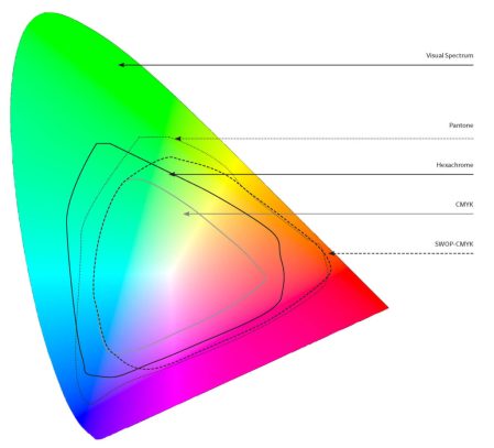
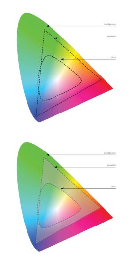
All of these examples describe gamut. Color gamut is the range of color that can be created by a device. This diagram shows the gamut of color perceived or reproducible by different color systems or “devices.”
The outer edge is the visible gamut that our eyes can perceive. The left diagram shows the gamuts of various RGB profiles (because you are viewing this on a monitor, you are not “really” seeing the true visible spectrum, which is why there are a zillion greens in nature). And isn’t it crazy that there are multiple RGB gamuts? The diagram on the right contains Pantone, CMYK, Hexachrome and SWOP CMYK gamuts.
If you are designing a logo for a website, in the RGB space area (the triangle at left, outside the inner CMYK area and you want it to match when printed, you are going to stress out. As you can see, in the lower diagram, the grayed out area is showing everything within the Adobe RGB gamut that is impossible to create with CMYK inks. Nearly the full orange wedge is outside the CMYK gamut. The Pantone bridge illustrates this for the Pantone universe.
Study this color model and you’ll see the areas to avoid. If you stick to the CMYK circle you will be able to match colors across CMYK, Pantone, and RGB. This may seem very limiting, but the truth is that in the CMYK circle, there are MILLIONS of colors. Also, don’t forget that rarely monitors are not calibrated, so reducing your RGB color space to a narrower CMYK reproducible space may increase your RGB consistency as well.
Before Pantone developed this product it was a real b*tch to try to match identity, and we had to keep logo colors in a really narrow spectrum. Now with the Pantone Color Bridge, we have millions of colors to work with!
[optin-cat id=243]


